Here's a weird thing that happens when you generate images with AI. You describe exactly what you want in a prompt — and the output still somehow looks... the same. Too clean, too pretty, too AI-ish.
The Krea team has known why this happens for a while. Most image models are great at handling "what to draw," but when it comes to "how it should look," they just default to the model's own aesthetic taste. That's where the AI look comes from.
Krea 2 is a foundation model built specifically to tackle that second problem.
So what even is a style AI?
Krea has been known as a real-time image generation tool since 2023. But this time, they built a model from scratch — for the first time. Krea 2 (K2) isn't borrowing Stable Diffusion or FLUX. It's a proprietary foundation model.
The architecture is latent diffusion (same family as Stable Diffusion and FLUX), but the training data is different. They used an aesthetically curated dataset centered on editorial photography, fine art, design, and concept art. The result is a model with "aesthetic judgment" baked in.
The core of it is the style transfer system. You drop in a reference image and Krea 2 analyzes its color palette, texture, brushwork, and lighting style — then applies those to whatever you're generating. The key idea: style becomes a controllable lever, not a prompt word.
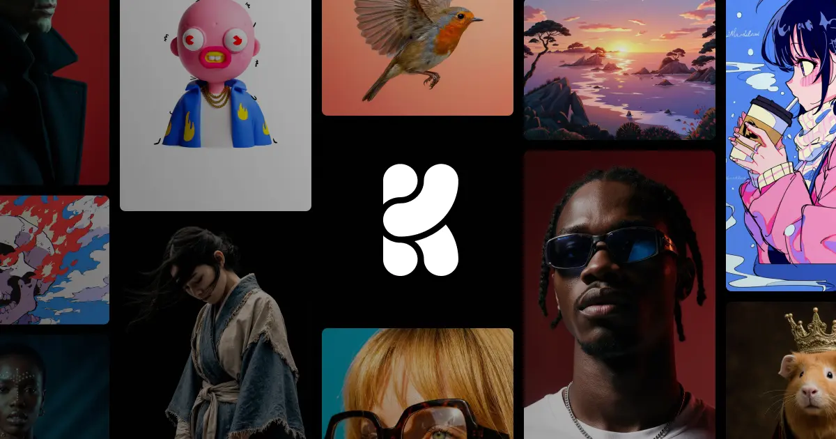
The style range is wide too. From gritty film photography to clean studio shots, cinematic stills, illustration, digital painting, and more experimental directions — they claim it can render virtually any style. That's a deliberate departure from the safe, pretty outputs most AI image models default to.
What's actually different from other models?
Right now the image generation AI market is dominated by three main models. They each have different strengths — and the comparison table makes it pretty clear where Krea 2 is playing.
| GPT Image 2 | Gemini Imagen 3 | Krea 2 | |
|---|---|---|---|
| Style control | Clean but low artistic range | Optimized for photorealism | Best-in-class (reference-based) |
| Prompt accuracy | Best-in-class (LLM-integrated) | Moderate | Interpretive (aesthetics first) |
| Text rendering | Best-in-class | Moderate | Weak |
| Photorealism | Moderate | Best-in-class | Weak |
| Best for | Marketing assets, UI mockups | Product photos, portraits | Concept art, moodboards, brand visuals |
Honestly? GPT Image 2 wins on text rendering and prompt accuracy. If you need text in a marketing banner or need a complex instruction executed exactly — GPT Image 2 is the better pick.
Where Krea 2 is unmatched is any work that needs style control. Moodboard-driven brand visuals, campaign concepts, editorial fashion imagery, game or film concept art — being able to drop in references and steer the visual direction is something no other model does right now.
Here's where it struggles, honestly
Text-heavy images (banners, posters), photorealism (product shots, portraits), and complex prompt instructions are all areas where GPT Image 2 or Gemini do better. Worth knowing before you dive in.
Here's how to actually get started
- Go to krea.ai → Select the image tool
Create an account at krea.ai and navigate to the image generation tool. Basic features work on the free plan. - Upload style reference images
Upload 1–6 images that match the style you want. Photos, paintings, brand visuals — anything goes. Multiple images let you blend styles. - Write a prompt + set style strength
Describe "what to draw" in the prompt, then adjust the reference influence strength with a slider. Crank it up and the output closely mirrors the reference vibe; dial it back and it just sets the general direction. - Create a moodboard session (advanced)
Upload 6–12 references to build a session-level style vector. Every image you generate in that session automatically gets the same consistent style applied — no LoRA fine-tuning needed. - Adjust batch variation
When generating multiple images at once, you can toggle between Cohesive (consistent palette and style) or Varied (more divergent outputs) to help you pick a final direction.
Best way to start if you're new
Grab 5 images from Pinterest or Are.na that match the mood you're going for and upload them as references. Keep your prompt simple, and set style strength to around 50–60% — that tends to produce the most balanced results.